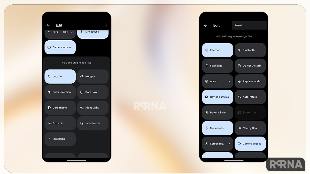
Android 13 stable update release is coming closer and the Google has proven its presence by making greater changes in its upcoming OS. Well! In this developing race, several other Android firms are taking part, and OnePlus is one of them. Recently, the Chinese smartphone maker, uncover the first look of its custom skin OxygenOS 13 which is also based on Android 13.
“JOIN ONEPLUS ON TELEGRAM”
However, there are multiple new changes made by OnePlus in its OxygenOS 13 and Google in its stock Android 13. But there is something extra you may find among both OS and that is a redesign Quick Settings panel.
Let’s explore everything what are the minor and major changes actually both OS has adopted?
OnePlus OxygenOS 13 vs Stock Android 13: Quick Settings
If we start comparing Quick Settings in both OS, Google has brings additional improvements in its stock Android 13. The latest quick settings panel includes some aspects that are really easier to use. The new feature effectively changes the layout of Quick Settings and adds more handy options for convenience.
What are the changes made in Quick Settings in Android 13?

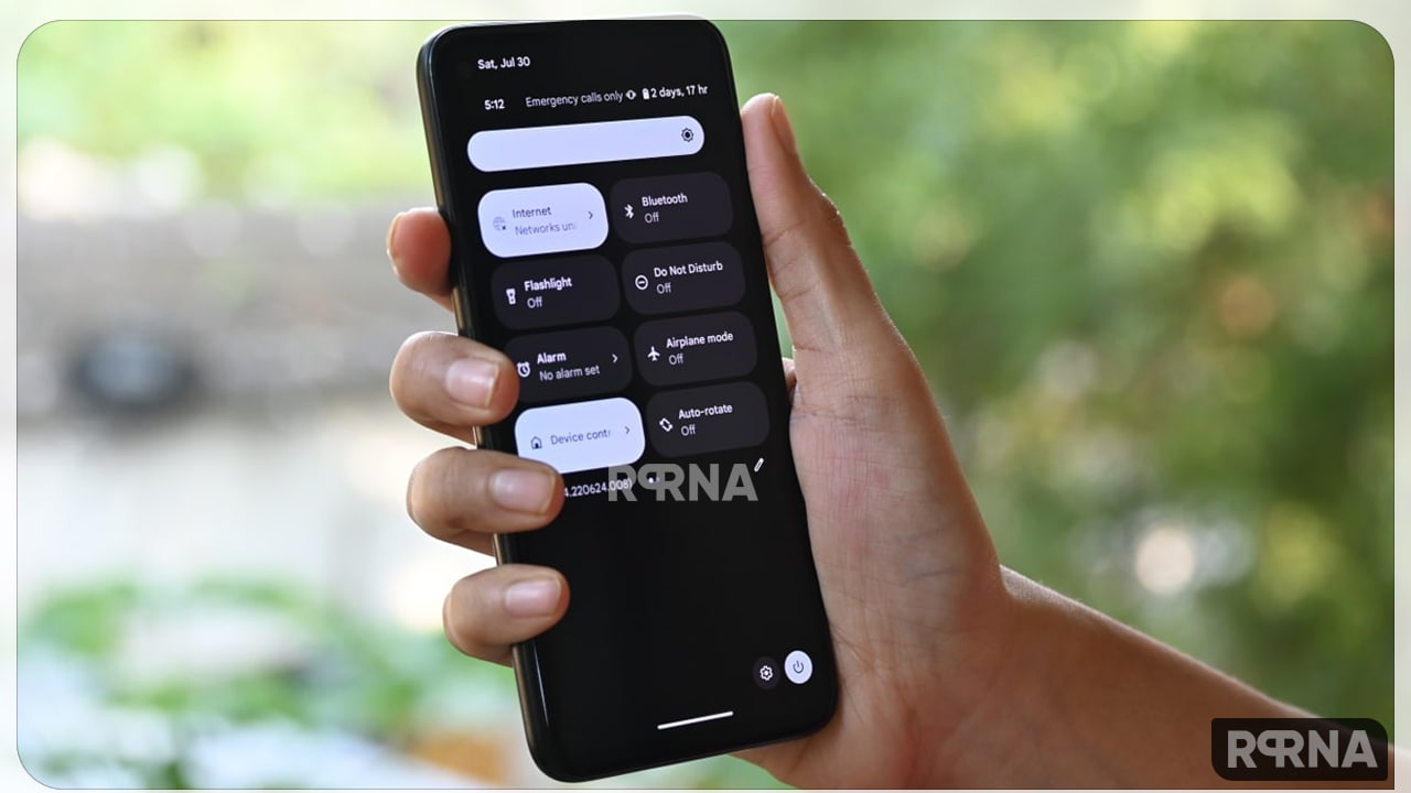
The first glance! This time Google adds unique icons in the Quick Settings options for simplicity and for its effortless work. As you can see, there are three different Quick Settings tiles and icons that occupy the screen when the user swipes down.
Going closer to stock Android 13, the power button and access button are moved to the system-level settings that used to be in the middle of the screen. But now it’s easier to reach with the thumb. As shown in the image shared, it is located in the lower right corner of the user interface. This could be minor for some but from my side, it’s really beneficial for my convenience.

Google may also eventually allow users to move them to the other side of the screen through personalization. This makes it easier for the users as not everyone is right-handed or left-handed. but haven’t seen it yet
Moving forward, the latest version of Google Android now displays an icon that provides easy access to the user’s account and profile details. It’s easier than ever to access and manage advanced account settings.
Lastly, the company also added a new chip-shaped icon that shows how many active apps are running. A quick tap on that will reportedly reveal what those apps are. It comes down to user data, privacy and security.
What about OnePlus OxygenOS 13’s Quick Settings Panel?

At the moment, OnePlus are unaware of its OxygenOS 13 look and Quick Settings Panel also includes but OnePlus is claiming its latest OxygenOS version is offing a fast and smooth experience, stable performance, a clutter-free design, and ease of use.
Though the system UX design has a more ColorOS feel, OnePlus users should be able to feel some familiar elements. Additionally, the company has given a better intuitive and efficient launcher. It provides large and small folders that are dynamically adjusted to improve organization.
In the end, we can only tell you this, we are still a step behind from the stable release but it could be even more possible that like every year OnePlus in its upcoming OxygenOS 13 (Android 13) update Google Android 13 will add features.

OxygenOS 13 Stock Android 13 Quick Settings


