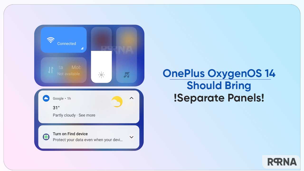
Android 13-based Xiaomi MIUI 14 welcomes a bunch of exciting features on the surface. But among several elements, the separate notification and control panel has impressively grabbed our eyes and we are sure that you would like to see this execution with the upcoming OnePlus OxygenOS 14.
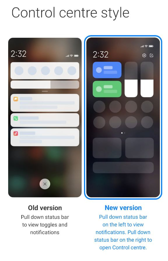
Yes! You read that right. Xiaomi MIUI features an individual and clean notification shade as well as a Control center. Unlike other Android skins, the tech maker did not mix both panels, instead created a tidy space on the home screen of the device.
Follow RPRNA on Google News
The manufacturer has designed this theme, based on an in-depth study of user preferences and psychology. Since the interface has been split into two independent sections, it provides an improved interaction and makes it easier for users to tell apart elements.
Join Us On Telegram
Moreover, you can choose accordingly whether you want the old way of dealing with notifications and the Control center or want to rely on the new version in the Settings menu > Notifications and Control Panel. To be specific, in a separate layout, you can pull down the status bar on the left to view notifications, and right to open Control Panel.

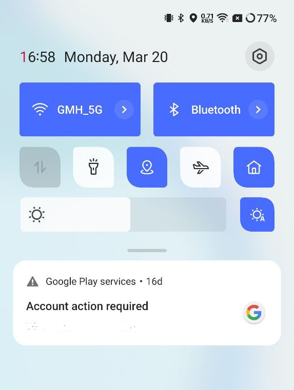
On the other hand, we have OnePlus OxygenOS firmware that has integrated the notification and Quick Settings efficiently into one space. This creation has its own perk as users don’t have to run two paths and can easily swipe through notifications and take some quick actions simultaneously.

How separate notifications and control panels are useful?
OnePlus does not introduce any such layout for the notification section so far. A major reason is – OxygenOS doesn’t fill the Quick Settings with various tabs and sections. If we check the latest one, OOS 13 has only two major tabs in the Control Panel and can open notifications in the same area.
But that’s not the case with the MIUI 14 as it bears the audio section as well. This is another demand of OnePlus fans that they want to be fulfilled with the OxygenOS 14 upgrade. For your information, the audio control panel enables you to launch and operate various sound-related functions without entering any application.

In short, a separate notification panel and control center is a good idea to implement with the OnePlus OxygenOS 14. As a result, you will be able to manage between operations more effectively, without any hindrance due to the bulk of matters on the same page.
What do you think about this matter? Would you like to have a separate notification panel and control panel with the next major upgrade for a spacious and clean look? Or are you happy with the one you have in OOS 13? Let us know in the comment section.


