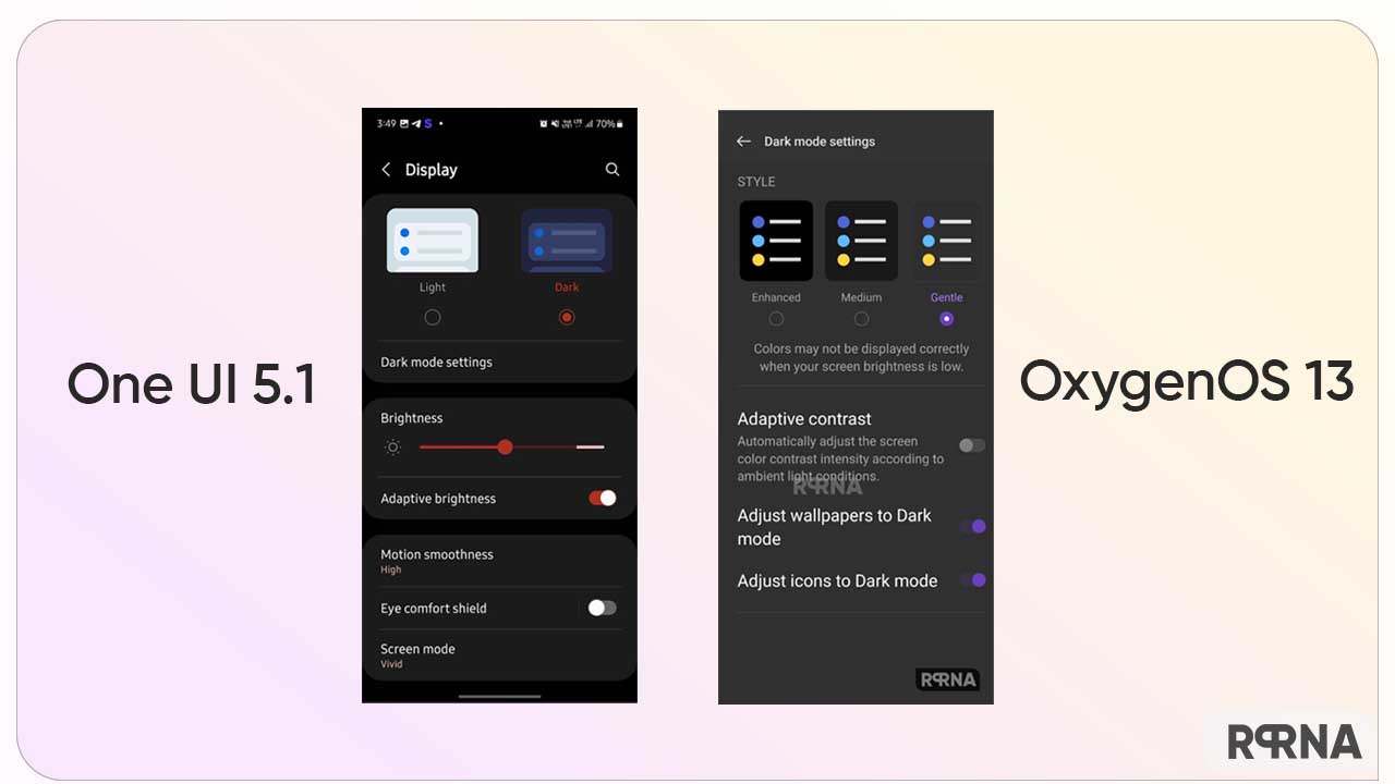
OnePlus and Samsung never miss a chance to offer the best and most useful features to their users. And today we are up with a comparison between OxygenOS 13 and One UI 5.1 for dark mode feature to see what changes these OS bring to the most common parts of the user interface.
Dark Mode – a simple yet most prominent feature in Android devices these days. As the name reads, the tool helps you to apply a darker color scheme over the light interface to prevent eye strain in low-light conditions. On the other hand, the dark mode also saves battery.
Follow RPRNA on Google News
Eventually, both Android 13-based skins have their own perks in this matter. Though we cannot deny the fact that Samsung is running far ahead in distributing software updates, still it lacks many of the tweaks that OxygenOS 13 can easily provide to its users.
Join Us On Telegram
Speaking of which, we have the OxygenOS 13 and One UI 5.1 dark mode comparison with us. So let’s start exploring the two most iconic operating systems and their difference in this context.

Samsung One UI 5.1 – Dark Mode
The Korean tech maker is considered one of the best players when it comes to dark mode features. Gladly, the company introduced this feature on One UI, even before it came by default on the Android project.
As of now, One UI 5.1 has further enhanced the accuracy and the color balance between foreground and background colors in the user interface elements. Herein, the dark mode offers a darker shade to the display that makes the overall appearance comfortable to the eyes.
OnePlus OxygenOS 13 – Dark Mode
However, OxygenOS 13 is one step ahead in this subject. It brings you three shades namely – Enhanced, Medium, and Gentle. Thus, you even have the choice to apply a dark mode as per your requirements.
Next, you can also set and adjust wallpapers according to the selected Dark Mode Settings. Hence, these prompts in OOS 13 make the respective functionality a little more effective.


