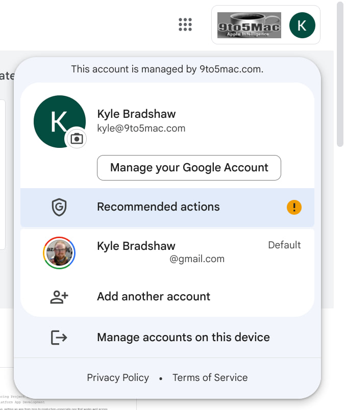
Google has not only made changes in terms of features but also looks after small details. In the latest development, the company has redesigned the Google account switcher tab for web applications with major UI tweaks and Material You styling.
So far, the small account switcher on Google apps (web version) already gained an outlook inspired by Material You tweaks. It is used to highlight rounded corners, an off-white background shade, and a limited amount of shadows. Once again, the company is trying to modify this look.
At present, the selected Google Account shows up in front and center, displaying your profile picture below your email address. The “Manage your Google Account” tab appears in a pill-shaped layout rather than a rounded rectangle.
Follow our socials → Google News, Telegram
Next, other Google accounts are listed below the tab. That’s not it! You can even collapse the list to conserve space. In terms of colors, all of the shades have shifted to be slightly darker. On the flip side, the profile-changing icon appears larger than before.

(Via)


