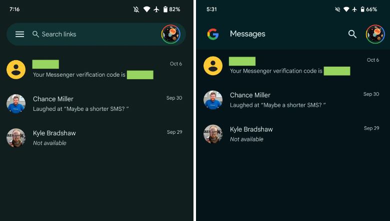
Google Messages is readying a redesign home screen which will drop the significant navigation drawer. Instead, there will be some impressive changes that will glorify the user interface of the application, offering a new experience to users.
According to the information, the home screen redesign on the Google Messages app now has a four-color G logo rather than the search field in the navigation drawer. The respective section will also have a ‘Messages’ text and a magnifying glass icon.
In case you are worrying about how you will access other functions in the app without a navigation drawer, Archived, Spam & blocked, Mark as all read, and Device pairing now resides in your profile avatar. These all options are now available in one place along with the app settings.

The redesign further consists of a shortcut to your Starred texts/chats here, as well as filters for Unread, Known, and Unknown, Images, Videos, Places, and Links. Meanwhile, the company has removed the Message organization feature.
Follow our socials → Google News, Telegram, WhatsApp

(Via)


