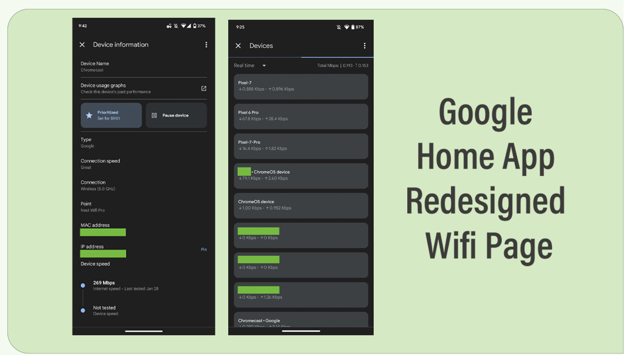
Google has recently redesigned the look of its Home app wifi page with some new device tiles. It will make the look of the Wifi interface new and unique, in addition to clear visualizations. Bringing modifications to the app enhances the user experience and Google always tries to provide a better-than-best interpretation.
According to the information of 9to5Google, the Google Home app Wifi page device tiles get redesigned, and now its the only place that notes a total count and opens an entirely new page. The other two pages of the Network including the internet speed and points get removed. Even, every single device is now housed in a separate rectangular box with rounded corners.
Follow RPRNA on Google News
There are two options available on the top of the interface, among which the left one shows the Real-time and the right option shows us the Total Mbps. There’s also the ability to see 1 day, 7 days, and 30 days, with Google Home now noting the precise date range. There is also a Connection Strength option that’s updated every 5 seconds and uses a three-bar Wi-Fi indicator.
Join us on Telegram
To be mentioned, this newly modified device page will not allow you to quickly Pause action from the main list. Instead, you have to select one, and then it takes you to a redesigned Device information page which lets you rename, pause, and prioritize a device. The latter gets a new 2-hour increment to join 1, 4, and 8, while you also get a countdown once set.

Moving on, selecting one device will also show you speed and info, with the ability to run tests at the bottom. Furthermore, the company has also shifted the device usage graphs to a new page where functionality is unchanged and it prioritizes the device information over those graphs.


