Earlier this year, Google updated YouTube Music and improved the Home feed for tablets. Further, the company has promised to enhance the UI mainly for the playlist with the next updates. In the meantime, one smaller change has been found on YouTube Music for Android tablets.
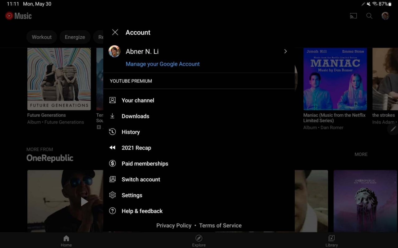
According to the information, YouTube Music has improved the settings layout on Android tablets. So, let’s talk in detail when you open the account menu on tablet-powered Android, now a pop-up menu appeared on display instead of a full-screen page found on phones.
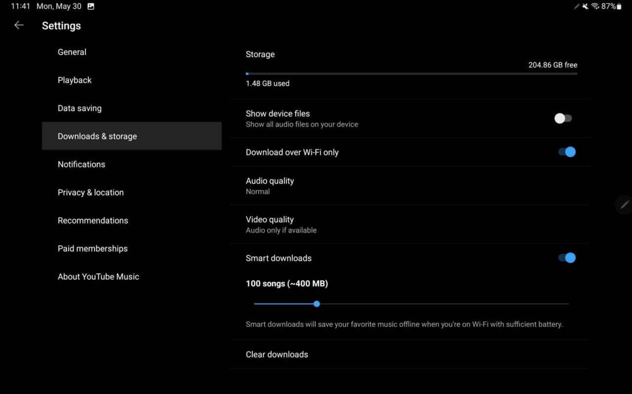
In the latest development, Settings is now divided into two columns to provide a better experience. However, this kind of Settings is also available on first-party Android apps including Google Search, Gmail, YouTube, and more.
JOIN US ON TELEGRAM
 What’s New:
When you open the Setting menu, the actual controls list or we can say the menu list appears on the right side. While the right side of the UI shows the list of options available under the particular control menu. Now, YouTube Music is removing the long list toggle and menu so you are no longer using long lists.
The Settings menu includes the grouped controls such as General, Playback, Data Saving, Downloads & Storage, Notifications, Privacy & Location, Recommendation, Paid Memberships, and About YouTube Music. Users can choose and open the settings sub-sections according to their requirements.
So, this improved settings menu for YouTube Music is much better and contains a lot of options. To be mentioned, these changes in settings are available for Android tablet users at the moment. Further, the YouTube Music list approach is also on iPhones and iPads.
Let’s have a look a YouTube Music Tablet Settings:

(Source: 9to5Google)


