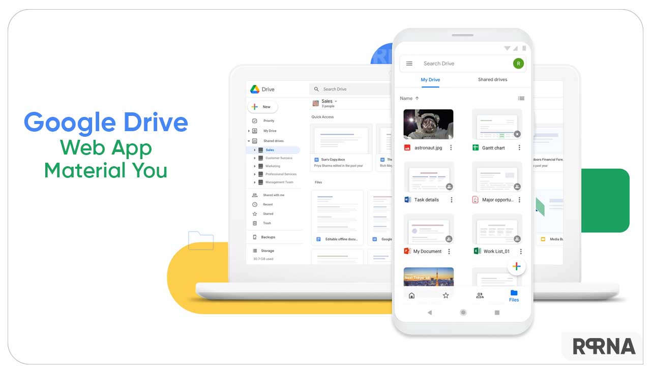
Google works focused when it comes to offering the most suitable experience to its users. Whether we look at Pixel devices or apps, the company prefers to revamp every element so that users can get the best product. Currently, the Google Drive web app is getting a new look with Material You.
According to the latest information, the US manufacturer initiated the expansion of Material You for the Google Drive web app and tools. Eventually, users will get some new visual enhancements to the web-based application.
Follow RPRNA on Google News
Up to this point, Drive’s appearance remains confined to the plain and messy outlook on the web. Rather than subtle and simple, it was more of an outdated version. However, the company is finally adding some new tugs to the Drive web interface.
Join Us On Telegram
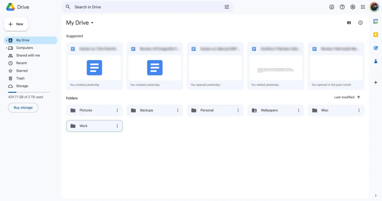
As per the inputs, the new interface is far better than the previous one. Consequently, it is more spacious and has a minimal base to go with. Though Google didn’t alter the web app much, it still pop-up as a fresh face.

Speaking of the changes, the home page of the application shows a grid of blue tiles for files and folders. The section that contains the files and folders now has a white background with a blue tint on the left and top sides of the application.
Apart from these, the header styles have attained more width. While the “New” tab for creation appears at the top left of the interface like a floating action button. You might have already seen such tweaks in other Android and Google apps.
The details further suggest that this Material You is applicable to Docs, Sheets, and Slides as well. As of now, the company is rolling out the feature widely although it is only available to a few users now. But don’t panic as you will soon grab the new pinches.
(Source)


