Google Photos is a favorite application among consumers for its prominent features and minimalistic settings interface. On the side hand, the US tech giant constantly put efforts into making the app a convenient place for its users. In the latest edition, the manufacturer is planning to organize the Photos service to some more extent.
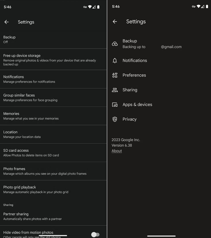
According to the information, Google is offering a cleaner settings interface to the Photos app. The changes are visible in version 6.39 of the application. Though the new development is not available on a wider spectrum, a few users are showing how the app has become more organized in terms of the settings page.
Recently, a Telegram user shared a screenshot, highlighting the modifications in the Photos settings part. Eventually, the section appears cleaner and more polished than before. As of now, the new layout contains six primary options where you can find the entire setting menu rather than a long list. These points include Backup, Notifications, Preferences, Sharing, Apps & Devices, and Privacy.
While things sound good, there are a few tweaks that tell the design is still under development. For instance, some of the options aren’t in the correct place. Meanwhile, the Sharing tab is present in both Prrivacy and Sharing sections.

On the flip side, the search option remains absent in both old and new versions. Perhaps, this addition could boost the process of searching right options in the settings menu. Especially, when you are unaware of most of the tabs and categories. Hence, it should be a part of this newest upgrade.
Follow our socials → Google News, Telegram
Another change is – Google Photos now reflects how much storage you have after deleting the images. But again, these new tweaks are limited to a few users at the moment. This is just the beginning and it won’t take much time for Google to push this version on a broader spectrum.

(Source)


