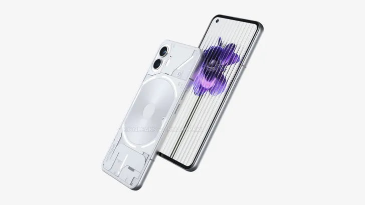
Nothing Phone (2) has started appearing in the headlines space and in the meantime, some concept creators have dropped new renders that show a powerful design. Although, the overall appearance is quite similar to the previous generation.
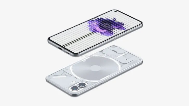
As per the renders shared by Smartprix, Nothing Phone (2) has a redesigned rear surface. Eventually, the company made some extra efforts in the lighting system. Perhaps, this will create a dynamic look at the back panel, compared to the old handset.
Moving ahead, the rear surface of the phone has curvy edges to a slight extent. It seems like a 2.5D design but looks quite slim in outlook. Moreover, the device also has a round frame which will effectively contribute to a strong grip.

Follow our socials → Google News, Telegram
Furthermore, Nothing Phone 2 has brought in a new charging coil, which could provide better wireless charging for extra convenience. On the side hand, the device consists of a SIM tray on the right, while the power button and volume rocker sits on the left. The bottom side consists of speakers alongside a USB-C charging port. Meanwhile, there’s no clue about a 3.5mm headphone jack.

(Source)


