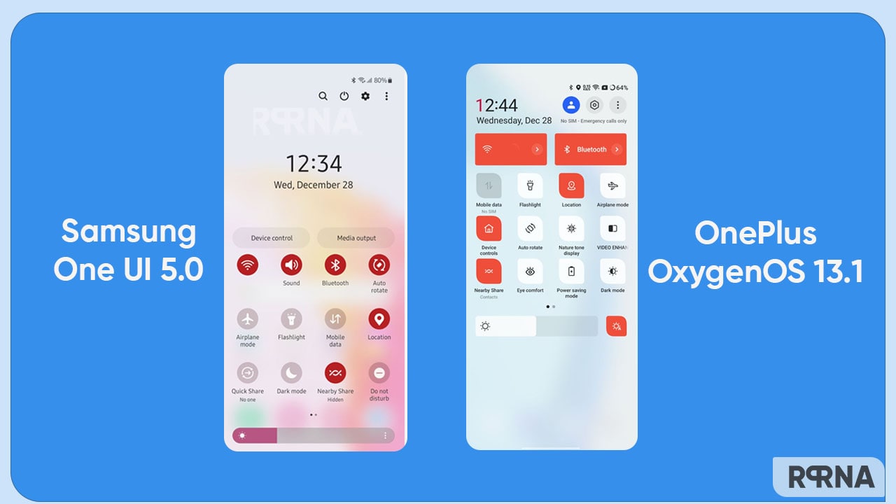
Samsung has released the latest One UI 5.0 with a bunch of eye-catching features and tools for its devices. On the other hand, OnePlus has also implemented the OxygenOS 13 (Android 13) with interesting elements and customizations. Today we are up with a short comparison of the OnePlus OxygenOS 13 and Samsung One UI 5.0 Quick Settings Panel.
As mentioned, both smartphone makers have imposed some notable changes and elements to their latest installment. And these changes are visible from the very starting panel. Hence, we’re here to spot the difference between Samsung One UI 5 to that of the OnePlus OxygenOS 13 in Quick Settings.
JOIN ONEPLUS ON TELEGRAM
Let’s begin the comparison below.
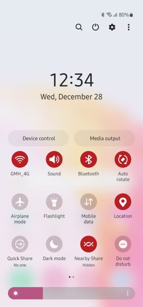
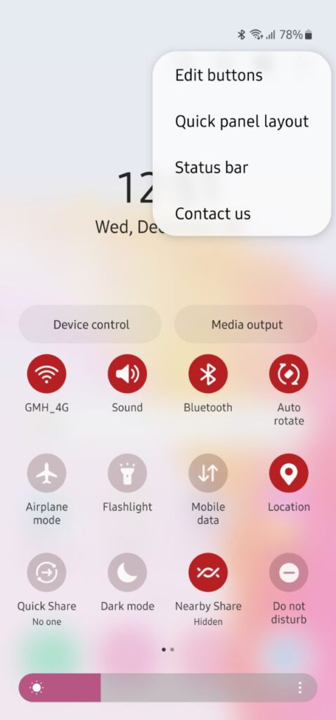
Starting with One UI 5.0, the Samsung quick settings panel looks interesting to swipe along with. This elegant-looking panel reflects a smooth and soft design on the surface. The top plane highlights four elements including edit, settings, power key, and search icons. Thereafter comes the date and time section followed by two separate tabs ‘Device Control’ and ‘Media Output’ to operate connected devices and their media exchange respectively.

Further, the shade shows various tiny buttons to enable a few actions instantly. Last, but not least, there is a wide brightness adjuster that has three dots menu. This menu opens a new page to adjust the brightness level or turn on the toggle of the Adaptive Brightness accordingly.

OnePlus OxygenOS 13 Quick Settings
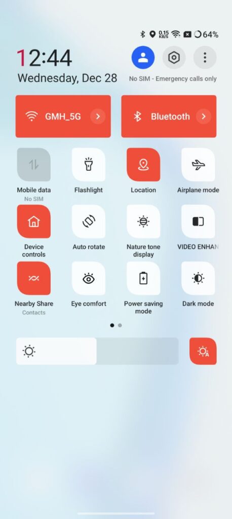
Now let’s check the other side. OxygenOS 13 has its own vibe and brings a classy quick setting panel on board. The top section seamlessly consists of an edit menu, settings, and profile icon. Besides, it holds date and time channels. The queue of tabs continues with the huge Wi-Fi and Bluetooth tabs.
After that comes the cluster of mini icons, letting you take some quick actions in seconds. You can even add more options in this panel. The first page includes Mobile data, Flashlight, Location, Airplane mode, Device controls, Auto Rotate, Nature tone display, Video enhancer, Nearby Share, Eye Comfort, Power Saving mode, and Dark mode.

On the next page, you will find some more thoughtful options. At the bottom side, there is a brightness adjustment slider with an Auto brightness icon. On pressing this icon for a second or two, it leads you to the ‘Display & Brightness’ page.

The overall theme of One UI 5.0 can steal your glance, while the smoother animations and access will let you fall for the OxygenOS 13.


