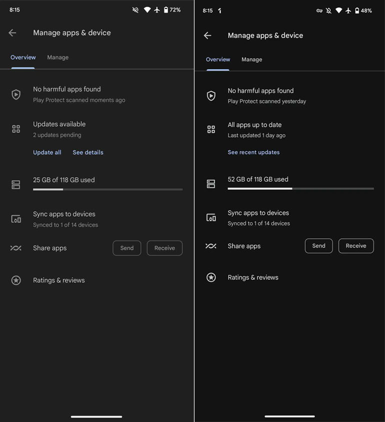
Google is making some random theme changes to the Play Store which will make it much darker. Earlier, we have a gray shade outlook in the background. Although the latest Play Store update highlights a little more black scheme.
Spotted in the 37.0.22-29 version, Google Play Store is getting a darker theme compared to previous builds. It’s not the AMOLED black that many of us prefer. Yet, a much better scheme than what we had before in the Play Store.
According to the details, the company has updated the background of every section including the four main tabs, app listings, Manage apps & devices, and Settings. Even the bottom navigation bar has been tweaked but it’s still lighter than the overall app for accurate contrast.
Follow our socials → Google News, Telegram
On the other hand, Play Store has skipped the Dynamic Color theming for a blue accent which would have highlighted more in the darker shade. The changes are still in the testing phase but some users might see them in the mentioned version.

(Via)


