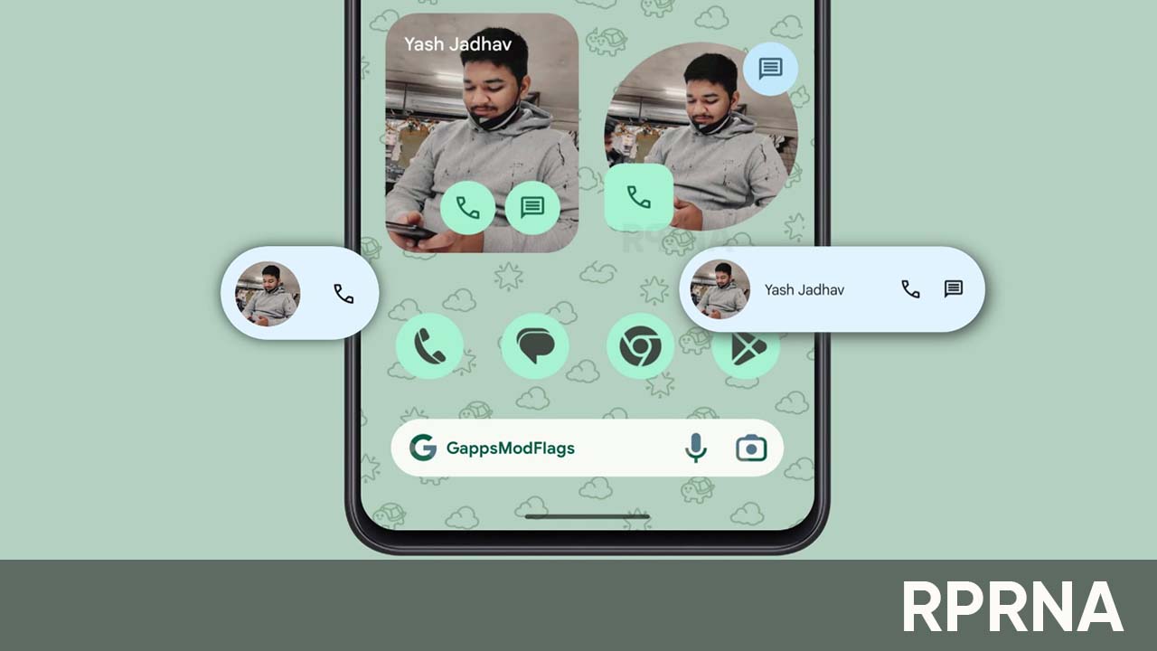
Google has recently rolled out a new update that brings more material tweaks to modernize the look of its Individual Contact Widget. To be mentioned, the update is rolling out with a 4.07 version of the Contact app.
Google Individual Contact Widget tweaks
After upgrading the app to the latest version, users will see, how the oval shape certainly fits Material You better than the previous rounded rectangle and gives it a more soothing look. But unfortunately, it misses the iconic circle with two shortcuts at the top-right and bottom-left, which is not that satisfying,
However, the smallest configurations of the Individual contact widget have a configuration of 1×1 and 2×1 which only show a circular profile image, and on the 3×1, you have a pill that adds a calling and messaging shortcut. While 4×1 and 5×1 show the contact’s name.
When you increase the height, you get a rectangular widget with the name in the top-left corner and the same shortcuts at the bottom. If you go wider, the Dynamic Color-themed buttons are located in the bottom-right corner, to offer more options.
It will allow users to take over an entire home screen, the users will further be able to quickly change the contact by holding down on the widget and tapping the pencil icon in the bottom-right corner.
- Follow our socials → Google News, Telegram, WhatsApp


