Google has silently revamped the Wear OS Play Store design. Notably, the new changes are quite similar to what we see in the Apple Watch and it looks like the US tech giant has tried to copy the outlook of the App Store for its wearables.
As of now, the app listings in search highlight bigger cards to show more information. Perhaps, you don’t need to scroll through a compact list for picking your favorite applications.
Speaking of additions, the Google Play Store design on Wear OS now has the app icon with an ‘Install’ and ‘Open’ tab on the right side. It further displays the app name, ratings, and screenshots below. Users would be able to find pretty much a similarity between the Apple Watch App Store and the Wear OS Play Store.
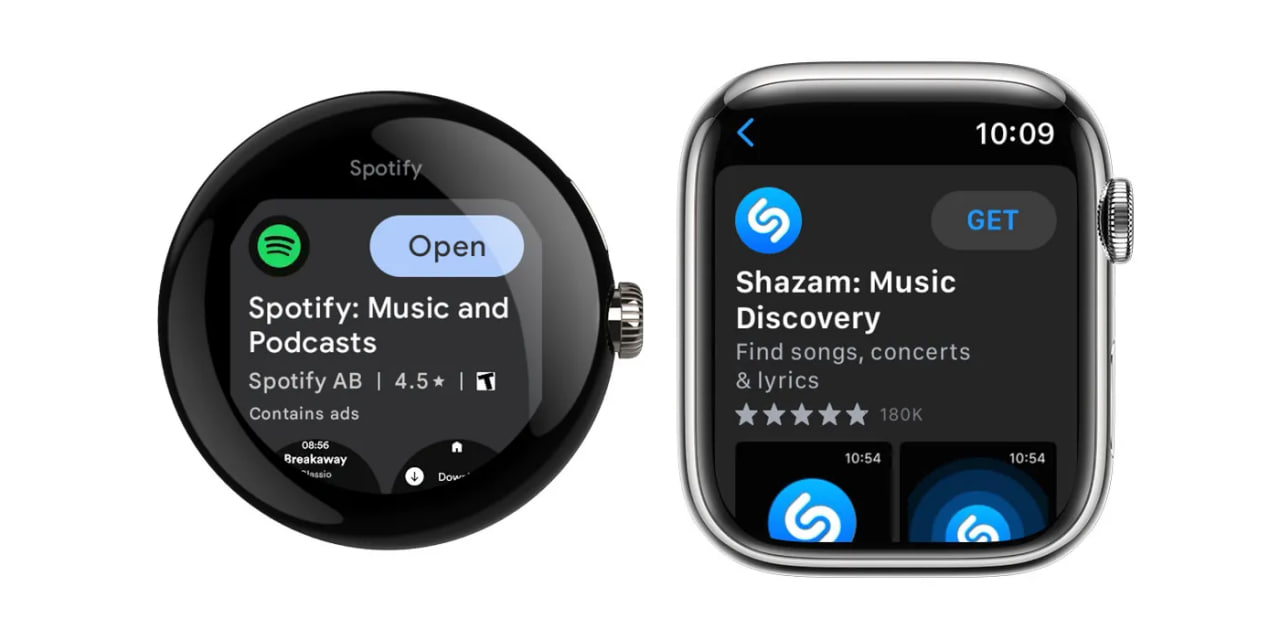
At the same time, we can say that the new outlook exhibits the details more clearly, just like in the phone version. The change is rolling out gradually and you will find these tweaks after installing the latest version.
Follow our socials → Google News, Telegram

(Via)