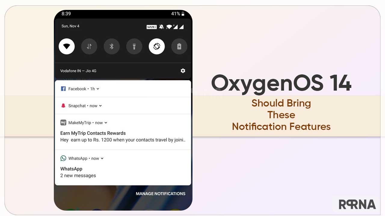
Android 14-based OxygenOS 14 will surely introduce several new and thoughtful features to OnePlus devices, but an important sector that really needs a good revamp is the notification section.
Not only we, but many users have pointed out their queries and experience with the notification shade of their phones. From the layout to the gestures, there are a bunch of segments that need to be modified with the upcoming OxygenOS version.
Follow RPRNA on Google News
On the flip side, Android 13 bumps the user surface with many reflective notification tweaks and gestures. But it looks like, the Nord developer has purposely disabled important UX features in the OxygenOS 13 software upgrade.
Join Us On Telegram
For instance, the number of total notifications, ways to minimize the notifications, swipe gestures, and more. Eventually, you can have a detailed view of these points below.

- The lock screen only displays the top 3 notifications, while hiding the icons of the remaining alerts. As a result, you can not acknowledge how many total notifications you have.
- There is no way to ‘Minimize’ notifications. This leads the alerts to appear huge in the panel, taking up the space on the lock screen, even if the ‘Silent’ tab is enabled.
- No swipe gesture to expand multiple notifications for a single app, and you still have to click the number.
- The notification light should have richer support
Notably, the notification drawer present on clean stock Android is simple and efficient to use. Although OnePlus has added so many tugs to the respective component that it often stops working and restricts actions like pulling down, and more.
Thus, the Chinese tech maker should implement a handful of useful features to the notification panel with the coming to OnePlus OxygenOS 14 upgrade.
Do you have any other suggestions related to the Notification section of your device? Or are you satisfied with the OOS 13 additions? Share your thoughts in the comment section.


