News
OxygenOS 13.1 quick toggles panel is more impressive than One UI, users report

OxygenOS 13 and 13.1 flaunts amazing tweaks when it comes to the UI and this fact gets clear visibility in the quick toggles panel. According to a large number of users, this segment appears more impressive in OnePlus OxygenOS software than in One UI or Pixel UI.
Recently, a digital nomad shared his thoughts on OxygenOS 13 superb quick toggles panel (also present in the 13.1 version). The tipster said that he like it more than any other software UI. Further, he explained a few points on how OxygenOS makes the entire user interface and Quick Settings more attractive than others:
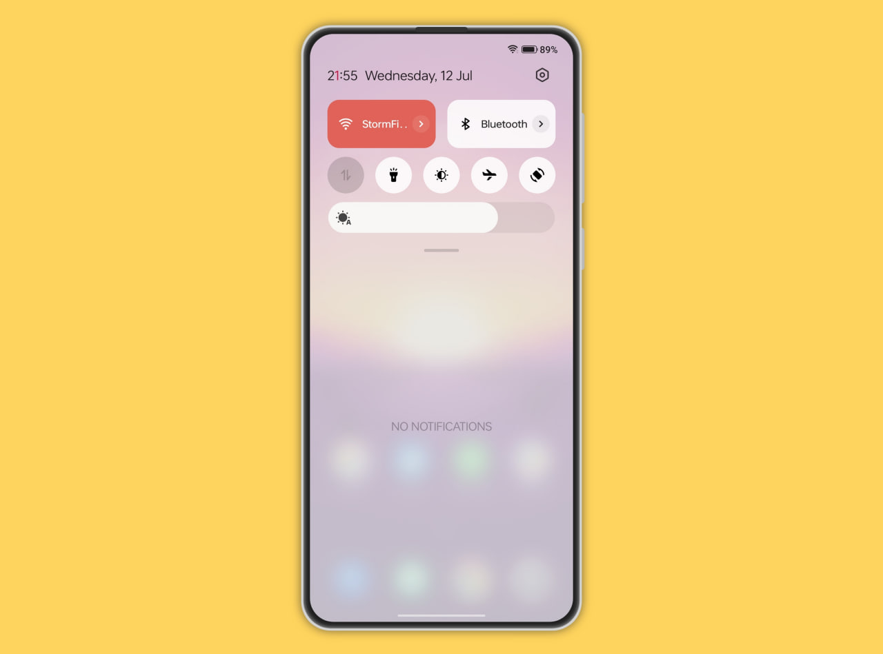
1. It contains Android 12 and 13’s tiled interface. On the flip side, it doesn’t show an outdated view like One UI software which still lacks the tiles even after holding several customizations.
2. OxygenOS has tiles for appropriate places and it makes sense. For instance, Bluetooth and WiFi. Other settings which are supposed to be toggles, are still just circular toggles. This ultimately saves a lot of space, unlike Pixel UI which doesn’t utilize space efficiently.
3. OxygenOS 13.1 has a more translucent and blurry effect in the quick settings toggles which delivers a great visual experience. On the other hand, the Pixel UI brings a bland look with original black and white shades.
Agreeing with these points, several users said that they love how OxygenOS Quick Settings and its toggles give a minimalistic look. Meanwhile, it combines the best elements of One UI’s and Pixel UI’s quick toggle panel, which again makes it awesome.
Follow our socials → Google News, Telegram
Do you feel the same? Let us know in the comment section.