OnePlus OxygenOS 13 and MIUI 14 is demand from our readers and it’s time that we dive more into this matter with the Settings UI comparison. In this head-to-head battle, we will search for similarities as well as differences between the two distinct software user interfaces.
MIUI 14 Global is the latest installment in the software lineup. The iteration is designed for efficiency and performance over previous builds and brings better features for Xiaomi devices.
Follow RPRNA on Google News
On the other hand, we have the dynamic OxygenOS 13, which comes with a variety of new functionalities to suit your OnePlus handset. Both builds are experts when it comes to software and user experience. However, some points highlight one over the other.
Join Us On Telegram
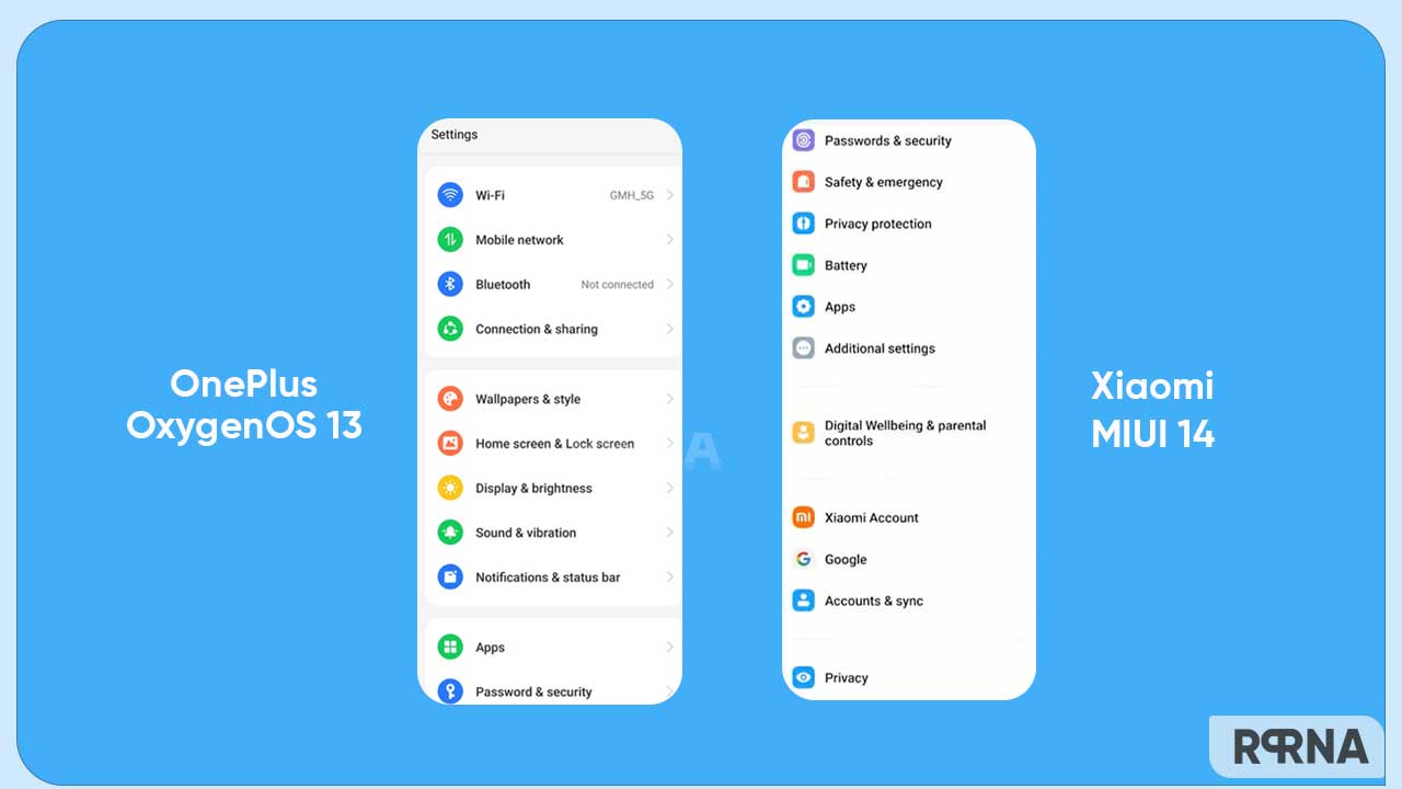
While Xiaomi says that MIUI 14 brings a cleaner and more intuitive Settings menu, we believe that OnePlus has done much better work in OxygenOS 13 on this aspect. Let’s understand this with the Settings comparison below.
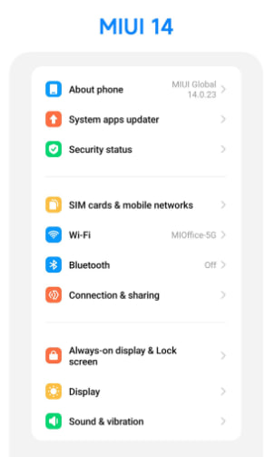
To begin with, MIUI 14 comes with a straightforward design that has been adopted from MIUI 13. However, it has better fluency that the past versions. Besides, the icons look bigger and are composed of vibrant colors, aligned in a cut redundant list. You can also merge menu options for efficient functioning.
See more clearly, and spend less time searching with the new settings design of MIUI 14.🎉#MIUI14 #NewSettingsDesign pic.twitter.com/vL1cmVLUR7
— MIUI (@miuirom) March 9, 2023
In terms of appearance, Xiaomi device owners will get a narrowed line spacing with more recognizable icons. The search is more effective and enables you to work speedily while operating the Settings menu.


OnePlus OxygenOS 13
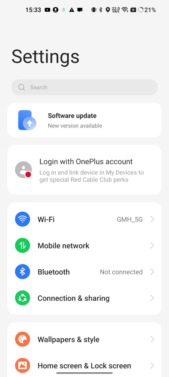
Of course, MIUI 14 is quite impressive but OxygenOS 13 is one step ahead and has better visibility than MIUI’s latest version. It has a new font family and fresh design that help you to understand the labels clearly.
While MIUI 14 has rounded-square-shaped icons, OxygenOS 13 brings circular shapes. Unlike MIUI build, OOS 13 has a round corner background card to group certain categories of options.
Yes, OxygenOS 13 offers the cleanest Settings interface, so that you can identify the sections at the first sight. The icons are not too small and not too large, which makes a perfect viewing combination.

In terms of appearance, the color vibrance is subtle. Together, the combination of icons, font, and overall color increases the user experience and allows you to enhance interactiveness with the user interface.
Moreover, if you open any of the Settings, you will see the corresponding section but there are also sub-sections to provide you with more information regarding that set of options.


