OxygenOS 13 is quite capable of beating the latest Android operating systems in multiple aspects. Its high-end functions and eye-catching tools can easily lock anyone’s eyes on the phone. And one of the most appreciable elements that we found in the OxygenOS 13 is the notification customizations.
Yes, customization plays a vital role in the user interface. With effective and interesting changes one can draw a new look on the home screen of their device. Consequently, OxygenOS 13 provides such notification customizations that are far better and smoother than the tech pack One UI 5.0 operating system.
Join Us On Telegram
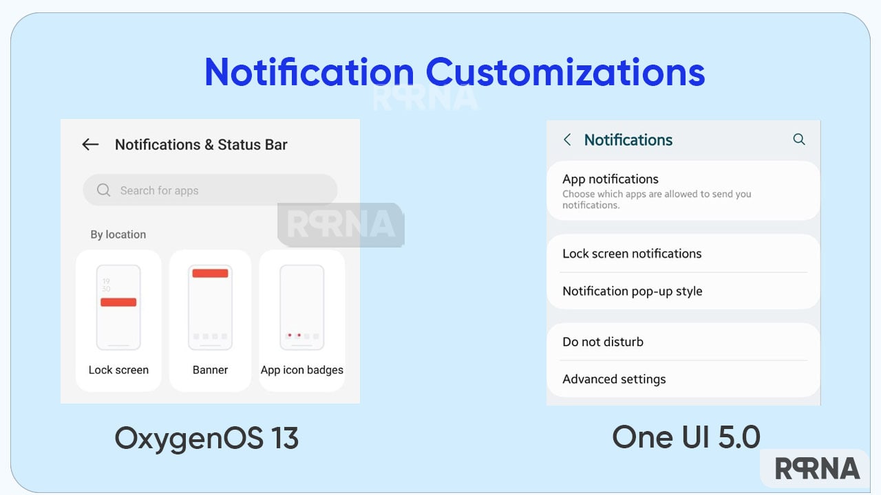
Both Samsung and OnePlus offer tremendous features for their handset users. It often becomes difficult to choose a smartphone from these alternatives. However, OnePlus and its OxygenOS 13 have overtaken Samsung in several aspects so far. Let’s understand the major differences between OxygenOS 13 and One UI 5.0 notification customizations.
One UI 5.0 – limited customizations
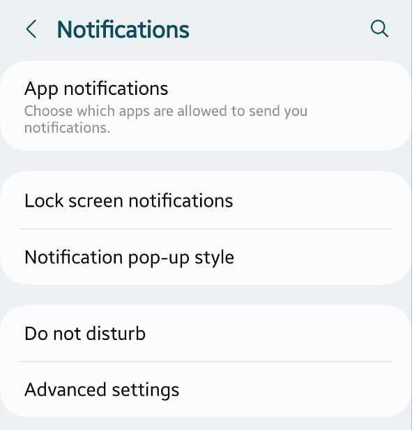
To begin with, One UI 5.0 delivers a limited number of features. For instance, Lock screen notifications that only allow you to hide content, notifications to show, and Show on AOD options. Further, it has the Notification pop-up style, again with a handful of choices.
Notification pop-up style:
- Apps to show as brief or detailed
- Edge lighting style
- Color by keyboard
- Show even when the screen is off
Even the Advanced Settings read only a few selections to make. Options like show notification icons, battery percentage, notification history, Conversations, Floating notifications, Suggest actions and replies, snooze, reminders, app icon badges, and wireless emergency alerts are the only medium to customize the notifications.

OxygenOS 13 – a world of customizations
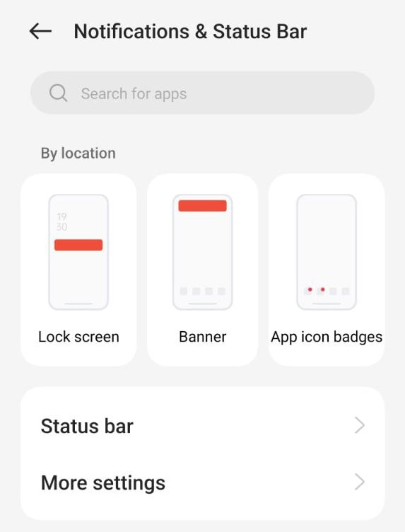
Meanwhile, OxygenOS 13 brings a vast area to explore. In the Notifications and Status Bar under the Settings menu, you will be first welcomed by the lock screen which enables you for the following options:
- Swipe down on the lock screen to view the notification drawer
- Lock screen notifications: allows how you want to see notifications
- Gesture: wake screen when a notification is received
- Banner: Simplify banner notifications when using an app in full screen to minimize distraction
- App Icon Badges: Choose how you want to see the notification symbol over an app

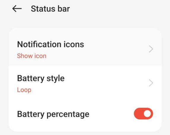
Thereafter comes the Status Bar which allows you to choose the notification icons, style the battery symbol, and show the battery percentage on the screen.
Status Bar
- Notifications icons: Consists of “show icon”, “show number”, and “do not show” options.
- Battery Style: Choose the way you want to see the battery logo on the top side. For instance, Horizontal, Vertical, Loop, or Do Not Show.
- Battery Percentage

Furthermore, there is a “More Settings” option, that brings you the following options for more efficiency.
- Display Data usage in the notification drawer
- Allow notification snoozing
- Reduce notification feedback
- Bubbles
- Enhanced notifications
- At a Glance
- Notification history
It’s worth mentioning that all the mentioned options work smoothly and give fantastic outcomes to users. Thus, it won’t be wrong to say that OxygenOS 13 offers better and smoother notification customizations that One UI 5.0.


